Exploring colour is one of the most exciting aspects of painting and design, and it is subjective because the colours we choose to have around us spark a range of emotional responses.
The colour wheel is a great tool for understanding how colours relate to each other and how to combine them in colour schemes. The example below is from The Colour Wheel Company – however you can pick them up from most paint shops.
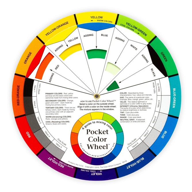
Source: The Colour Wheel Company
The first thing to know: Colours are created in different ways.
- Primary colours: Comprise of red, blue and yellow, and are the building blocks from which all other colours are mixed;
- Secondary colours: Violet, orange and green, are created by mixing two primary colours. On the colour wheel, each secondary colour is shown between the two primary colours that create it – for example the wheel shows that red and yellow make orange;
- Tertiary colours: Are created by mixing a primary and secondary colour.
Colours have qualities we associate with temperature.
- Warm colours, from yellow to red-violet on the colour wheel, tend to visually advance towards you. They are energising, but can also make a space feel smaller, cosy and enveloping.
- Cool colours, from violet to yellow-green, tend to recede. They are restful, calm colours, suitable for bedrooms and bathrooms. Light, cool colours can make a room appear larger or more open.
Harmonious schemes: are created by selecting colours from the colour wheel according to the following predefined schemes. Using these guides will ensures that the combinations will always look balanced, natural and pleasing to the eye. Here are some of my favourite simple predefined harmonious schemes.
- Complementary schemes are created from any two colours that sit directly opposite each other on the colour wheel, such as red and green, or blue-green and red-orange. I use a lot of complementary schemes in my paintings as I love the vibrant, bold and dramatic effect they create. Just remember when using these colours, one of the complements in the scheme should be dominant, with a smaller proportion of its complement used as an accent colour.
- Analogous Schemes. Groups of three to five colours that sit next to each other on the colour wheel are known as analogous – for example Violet, Blue-violet, Blue. These colours can be mixed without clashing because they share a common colour and provide a very harmonious and sophisticated look that is pleasing to the eye. You’ll see this form of scheme often seen in nature. For example, think about an Autumn vista as the leaves start to change colour… beautiful!
- Monochromatic schemes are based on one colour with a range of tints (this means white has been added to the colour) or shades (where black has been added to one colour). They are calm and restful, but the addition of loads of texture and pattern is essential to enhance the scheme and prevent monotony. This is my go-to approach for creating interiors
- Achromatic schemes: These are schemes without colour combining black, white and grey – none of which are true colours. These schemes are usually seen in contemporary or modernised homes, are restrained and sophisticated and make a bold statement due to the strong contrast of the colours. Pops of accent colour are essential to soften the scheme and prevent the room looking too stark or drab.
This is just a small insight into how I think about using colour both in my paintings and in my interiors and there is loads more information available on the topic. Next time you are designing a room or trying your hand at painting – why not start by picking up a colour wheel from your local paint store, having a play around with it and giving it a go!